Heritage Foods
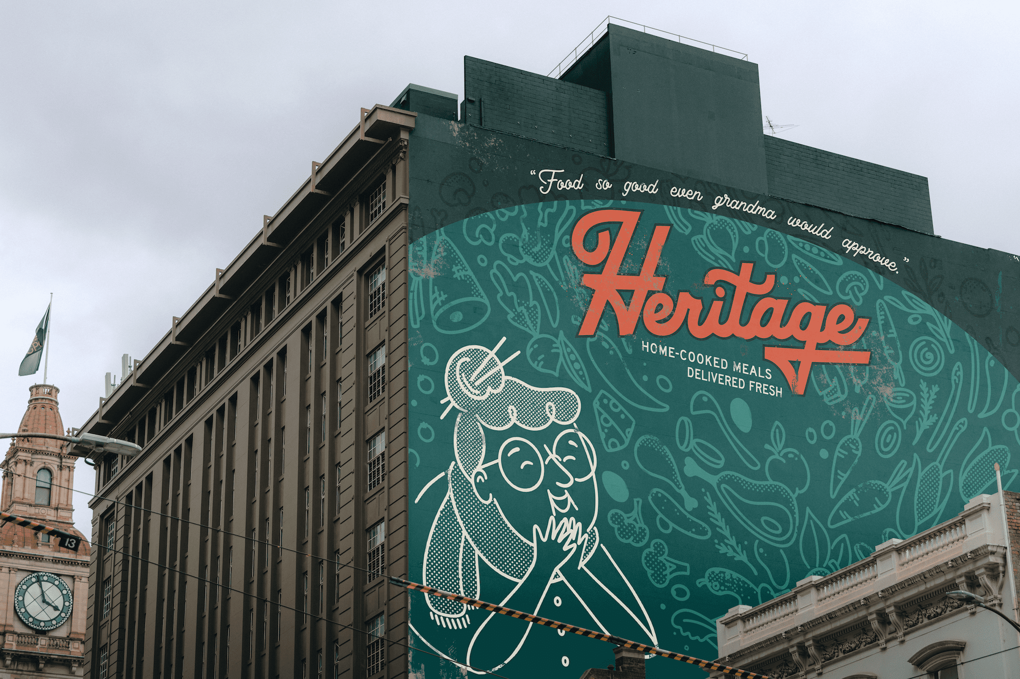
Heritage's brand system answers the challenge: how might we capture a time and place without resorting to “kitsch,” “retro,” or “vintage”? The result? a brand that rings true to its inspiration (1950s groceries), but cast in a fresh modern context.
Services
Branding
Illustration
Packaging Design
Date
October 2022
Scroll
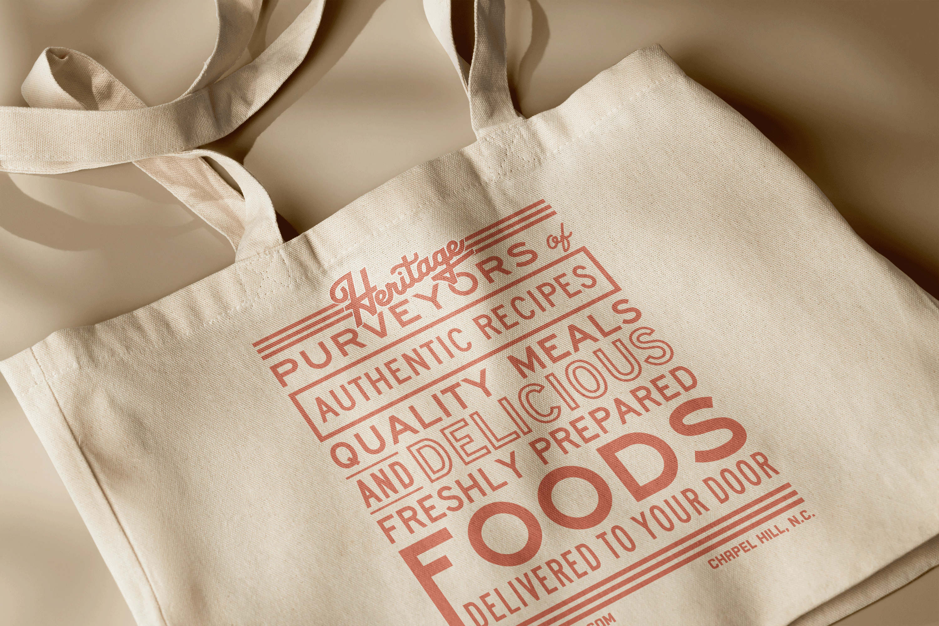
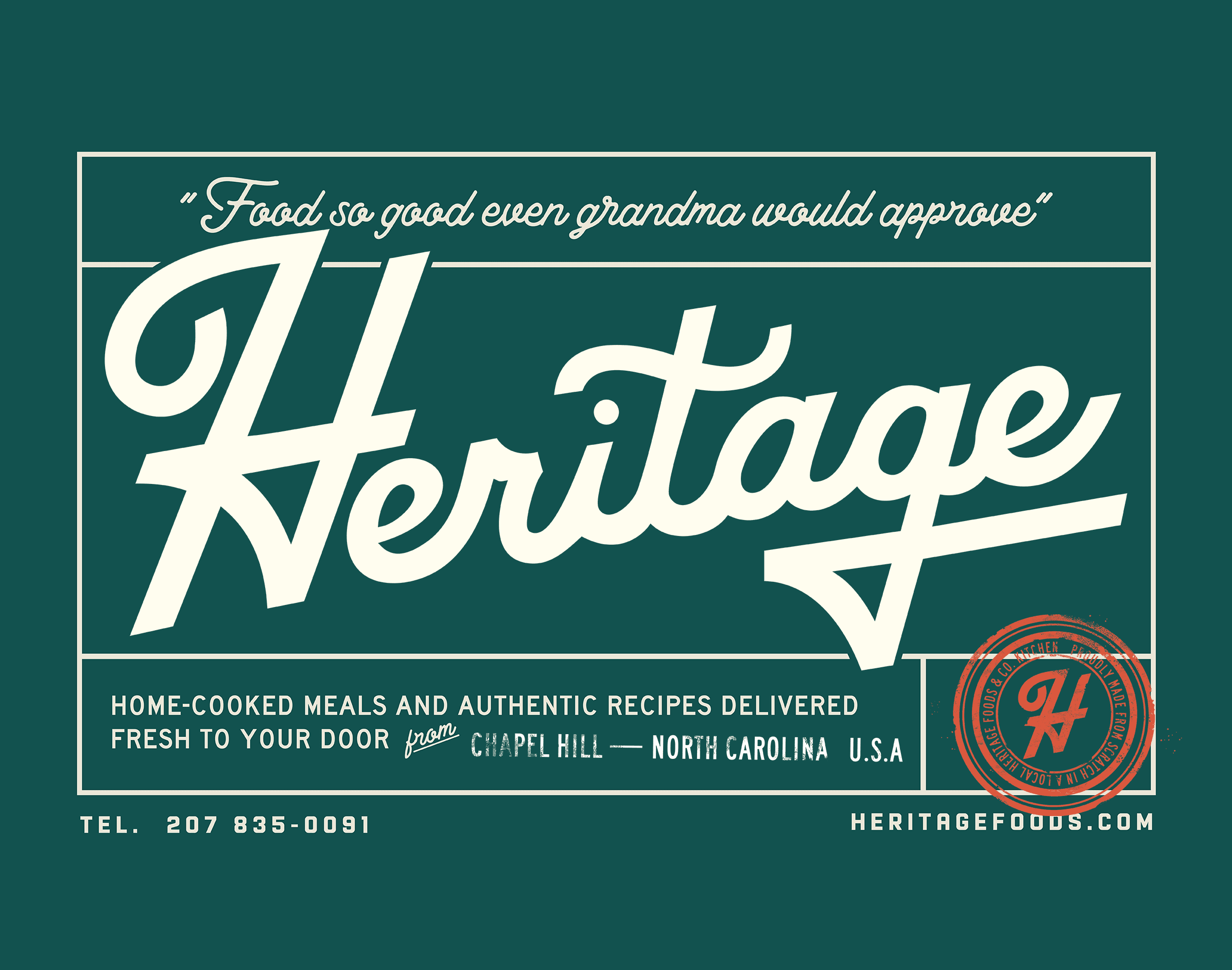
TYPOGRAPHY & DISTRESSING
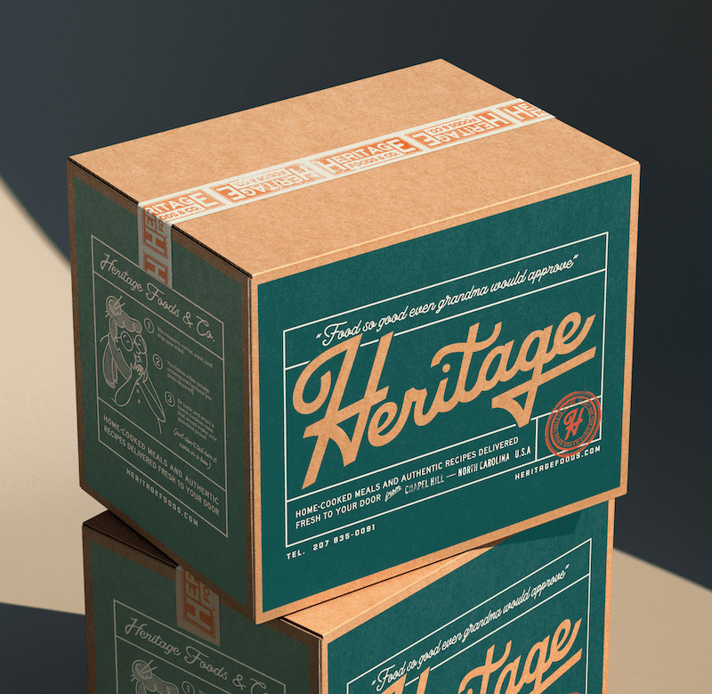
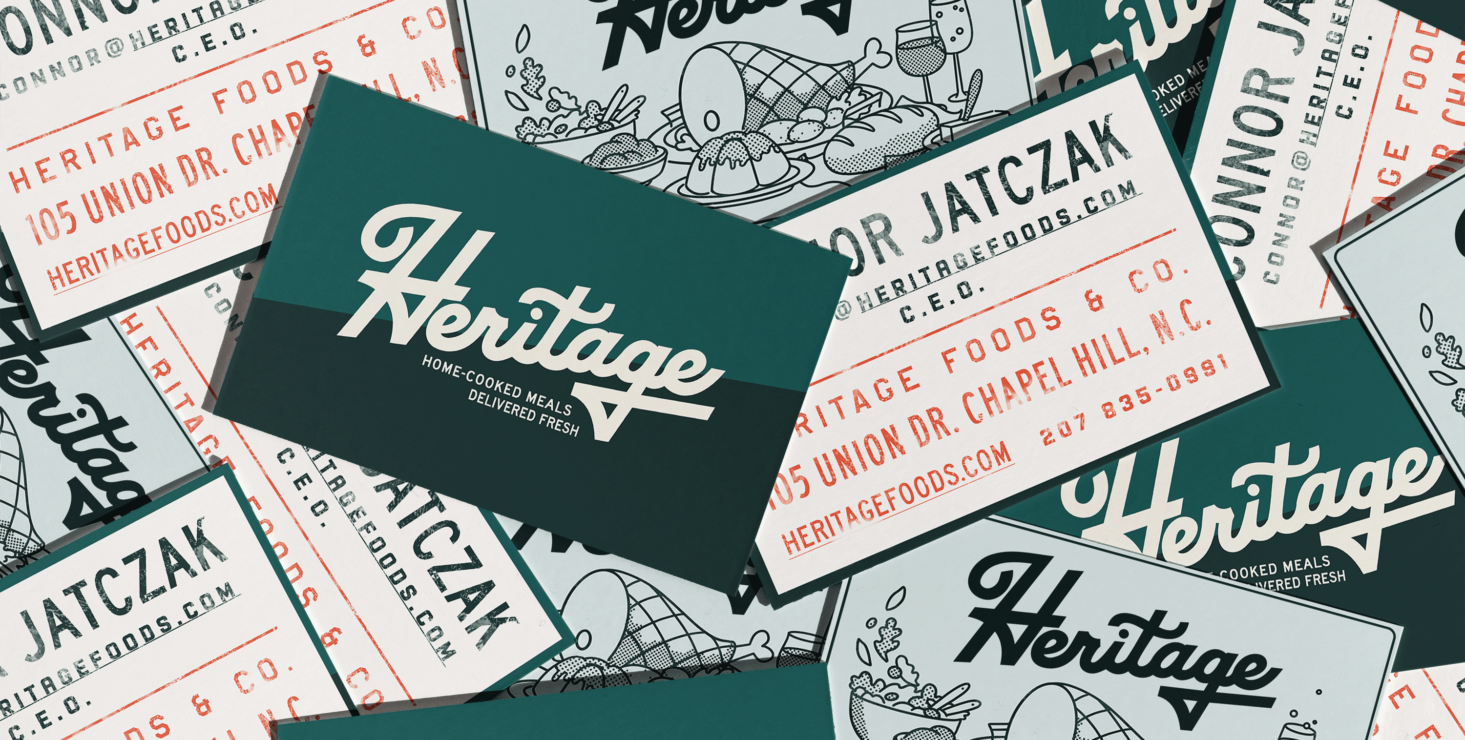
Heritage's branding emulates the charm of a local 1950s grocery or deli by replicating the kind of variation in typography and logo that might occur over several decades in a family business but maintains unity through the color palette and
copywriting tone. Inspired by the work of The Family Bros Studio and Annie Atkins, the visuals also incorporate the unique distressing of a variety of historical artistic techniques such as rubber stamping and hand-lettering.
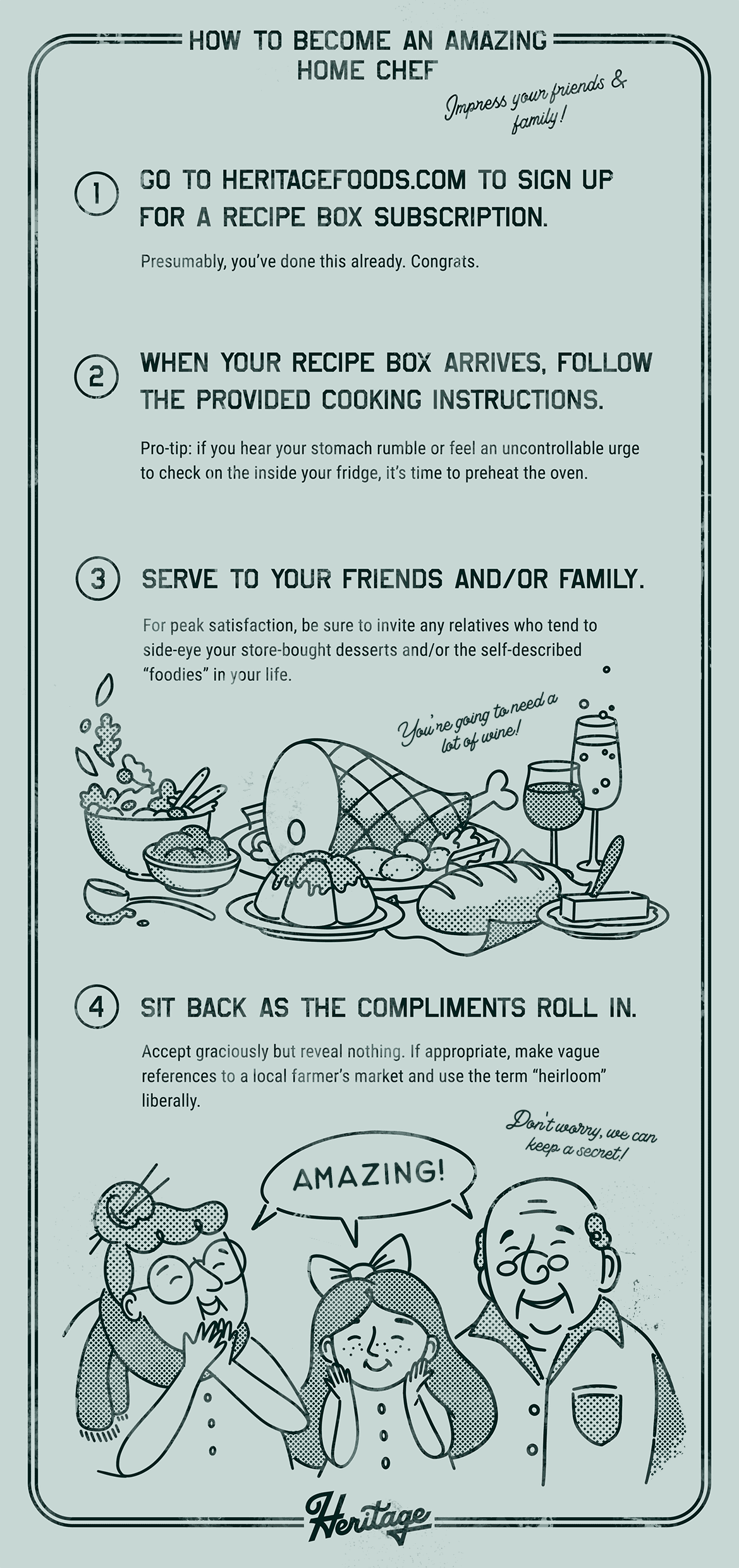
ILLUSTRATIONS & ART DIRECTION
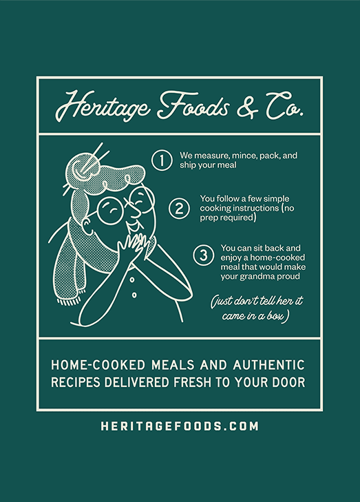
The illustrations combine more modern character styles with halftone shading and mild distressing to produce a familiar family who would look as at home on the packaging of a trendy DTC brand as they would in the comic
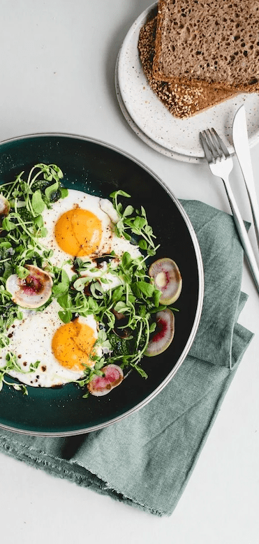
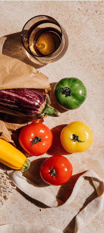
section of a 60s newspaper. Beyond hand-drawing, Heritage's imagery is also strengthened through the use of occasional accent photos of prepared meals chosen for the vibrant warm and cool tones of the food.
