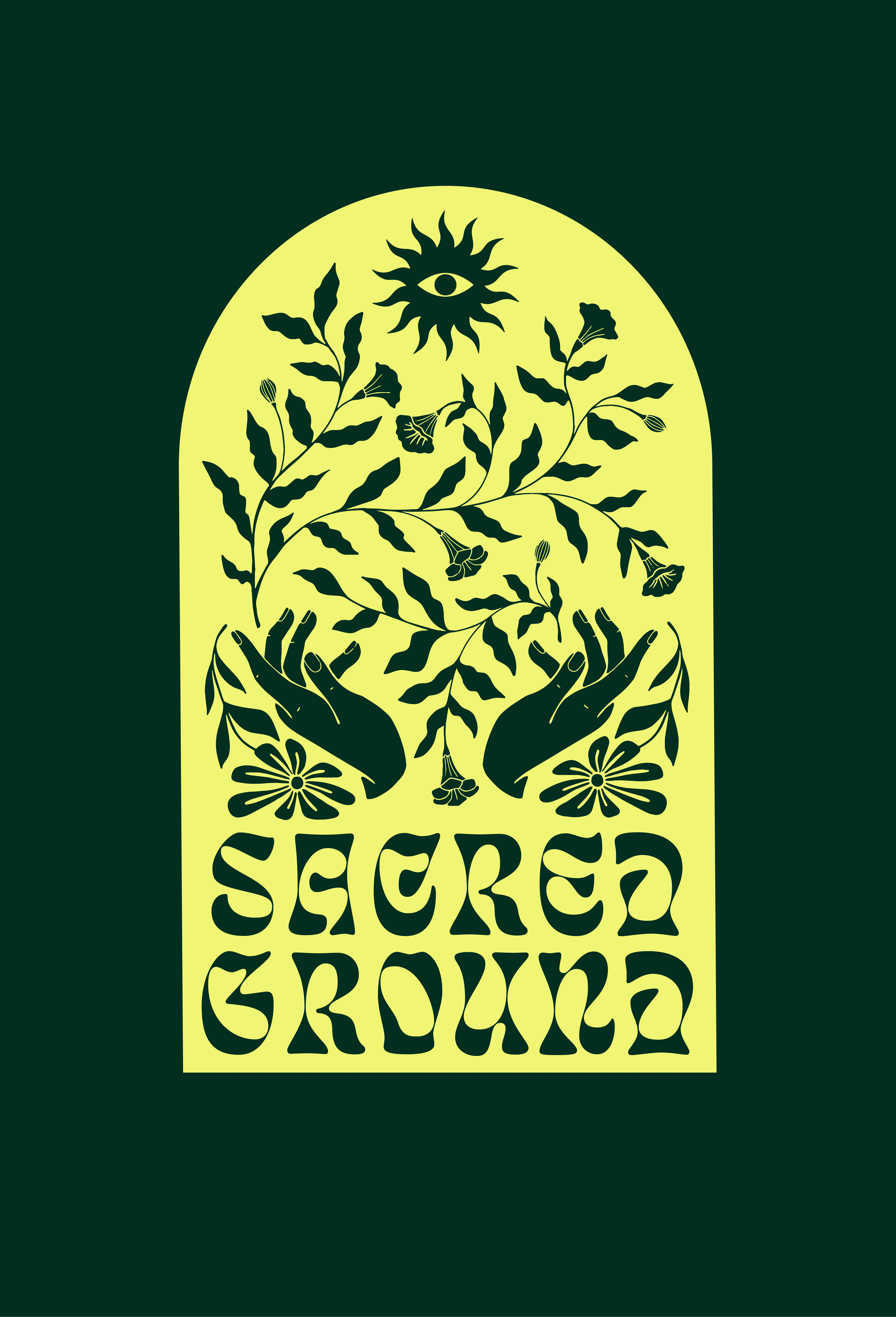
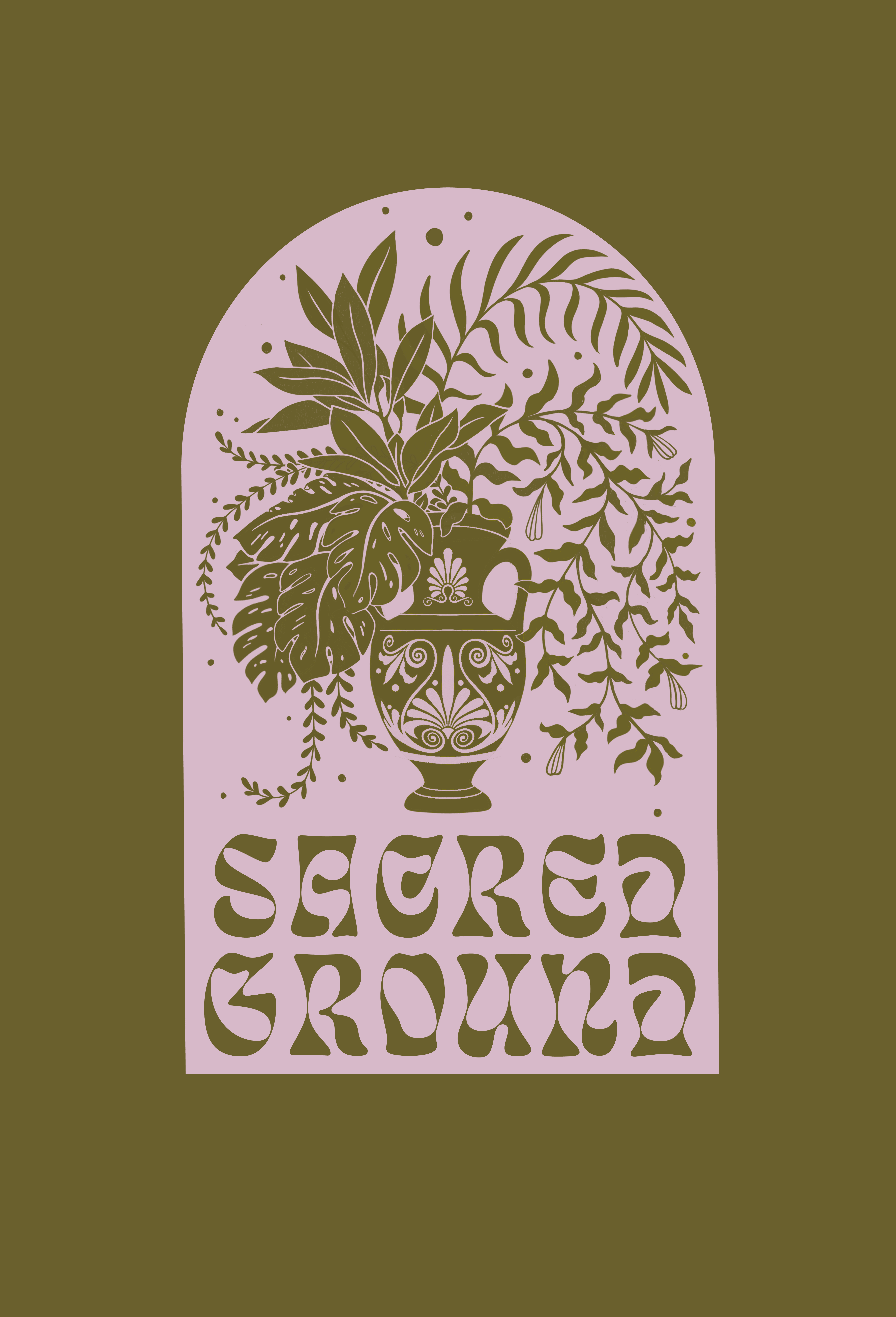
Sacred Ground
Through their hand-drawn illustrations and symbolism drawn from traditional folk art and religious and mystical sources, the brand celebrates the preservation of nature, both indoors and out.
Services
Branding
Illustration
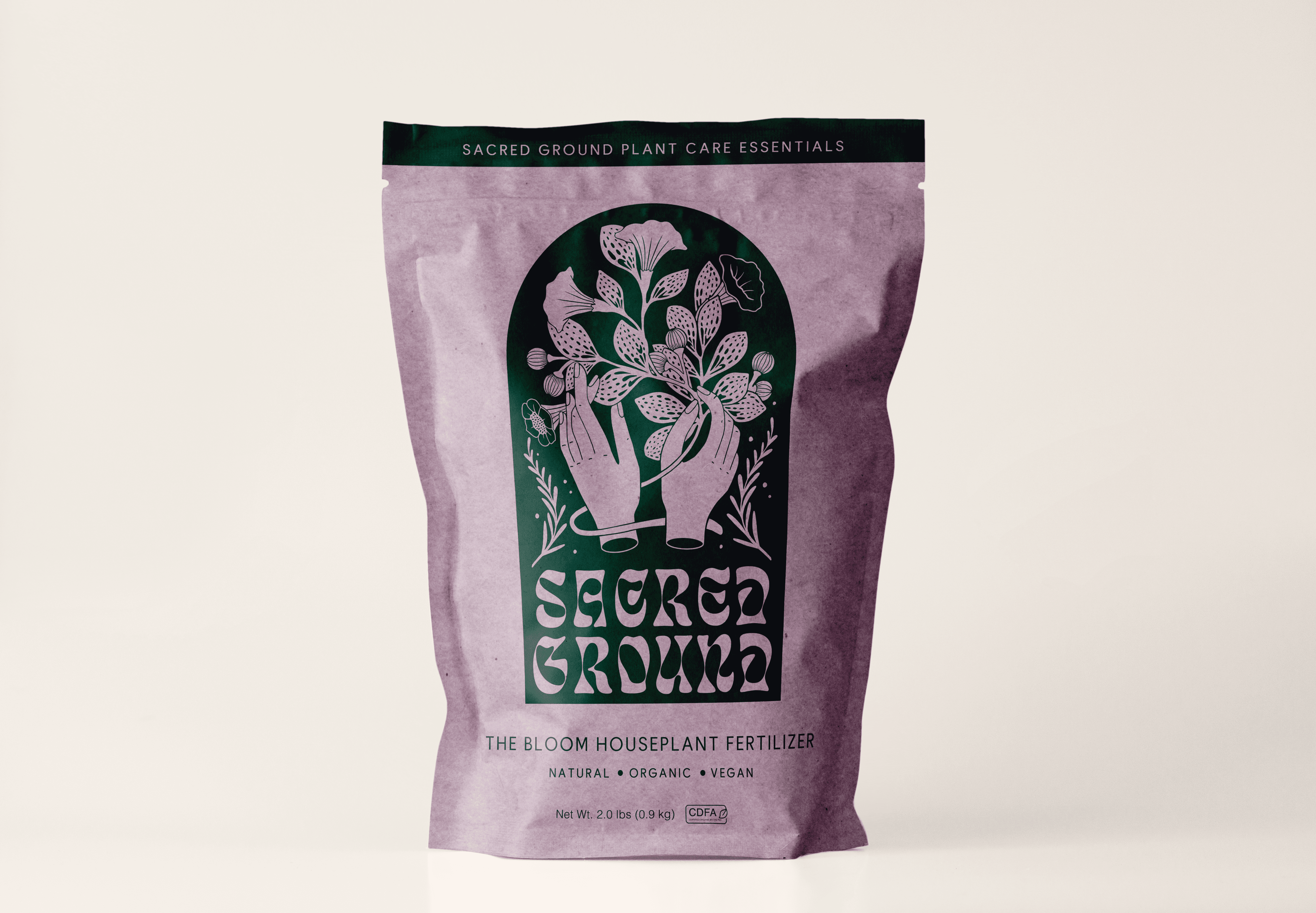
Packaging Design
Date
October 2021
Scroll
TYPOGRAPHY
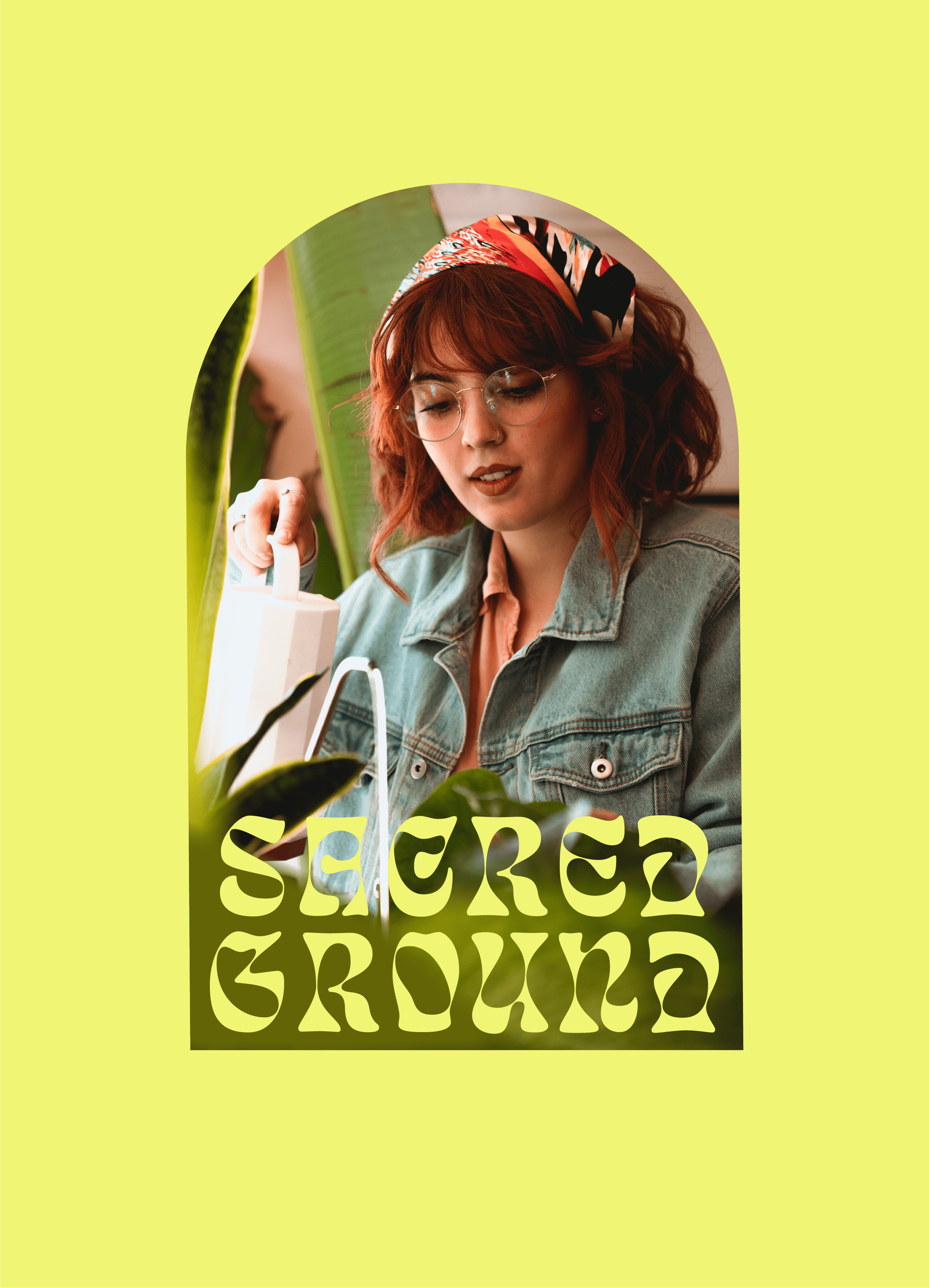
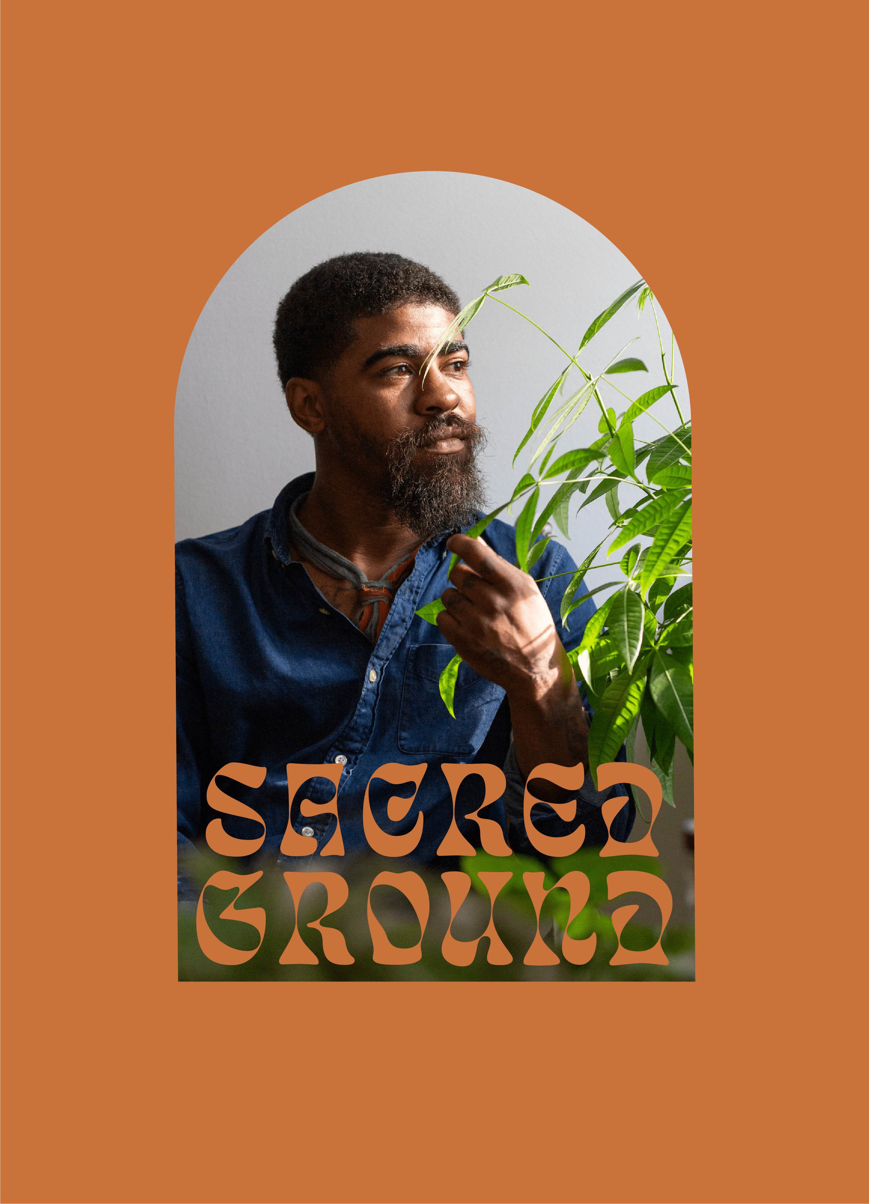
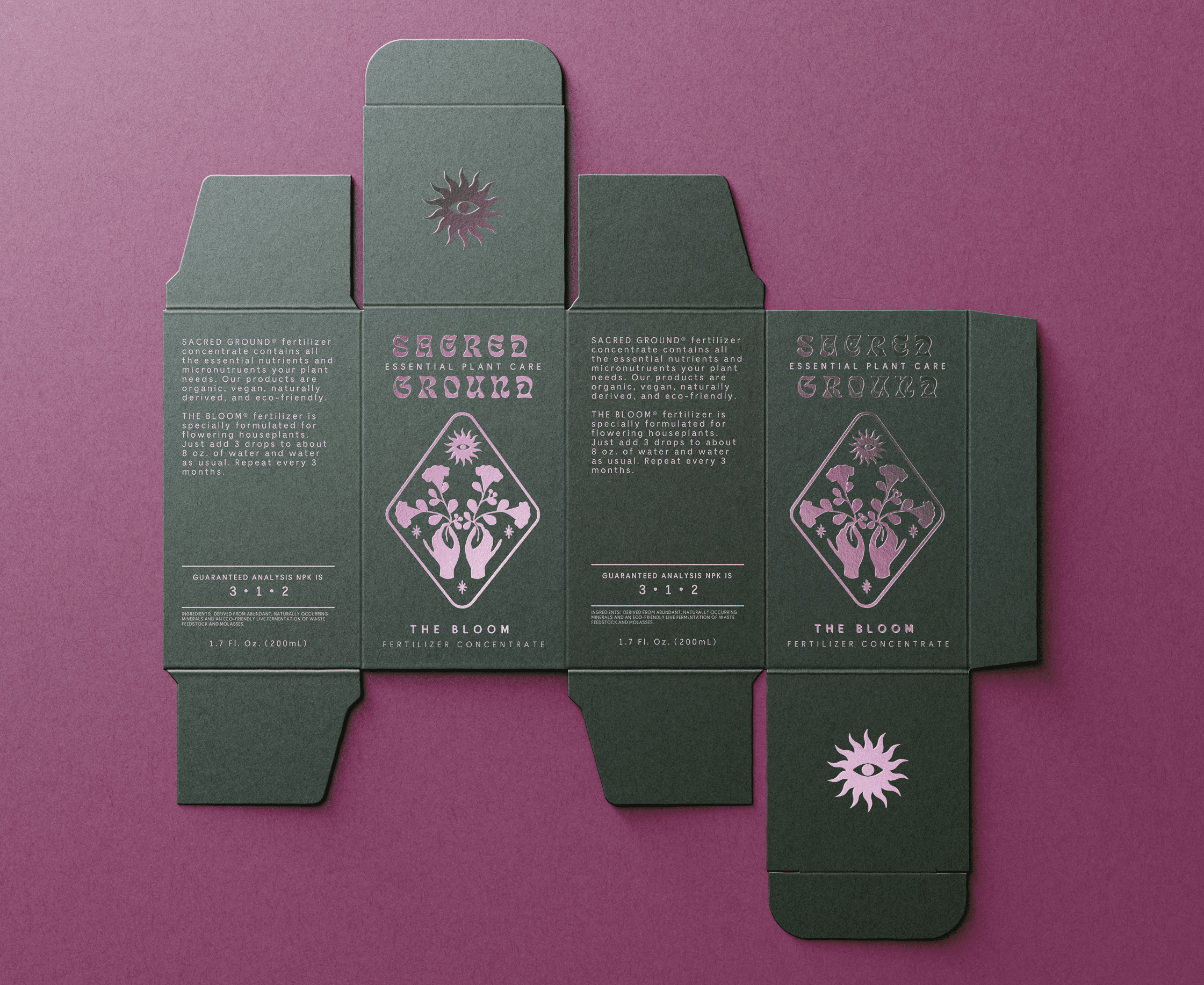
The brand's wordmark utilizes Eckmannpsych, capitalizing on the recent trend towards Jugend-ish fonts, that hasn't yet hit the commercial mainstream. The psychedelic futurism of its design represents a rejection of the understated grotesks that have ruled the last decade
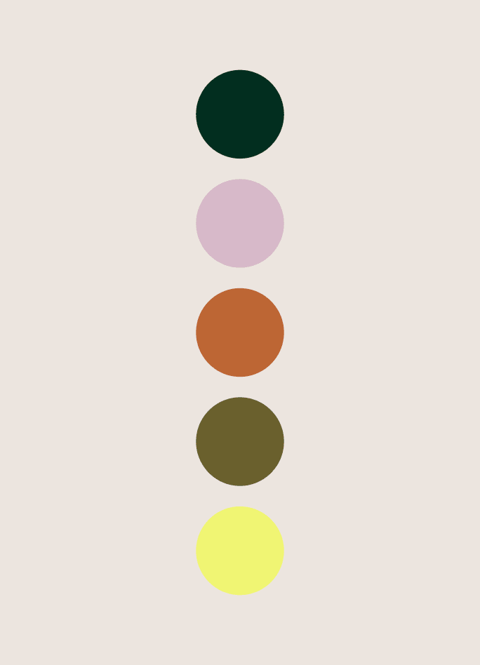
and a desire to inject life, authenticity, and personality into visual design, a perfect match for Sacred Ground's rejection of mainstream industry practices. Meanwhile, the brand's bold color palette and psychedelic wordmark are balanced with a clean modern sans-serif.
ILLUSTRATIONS
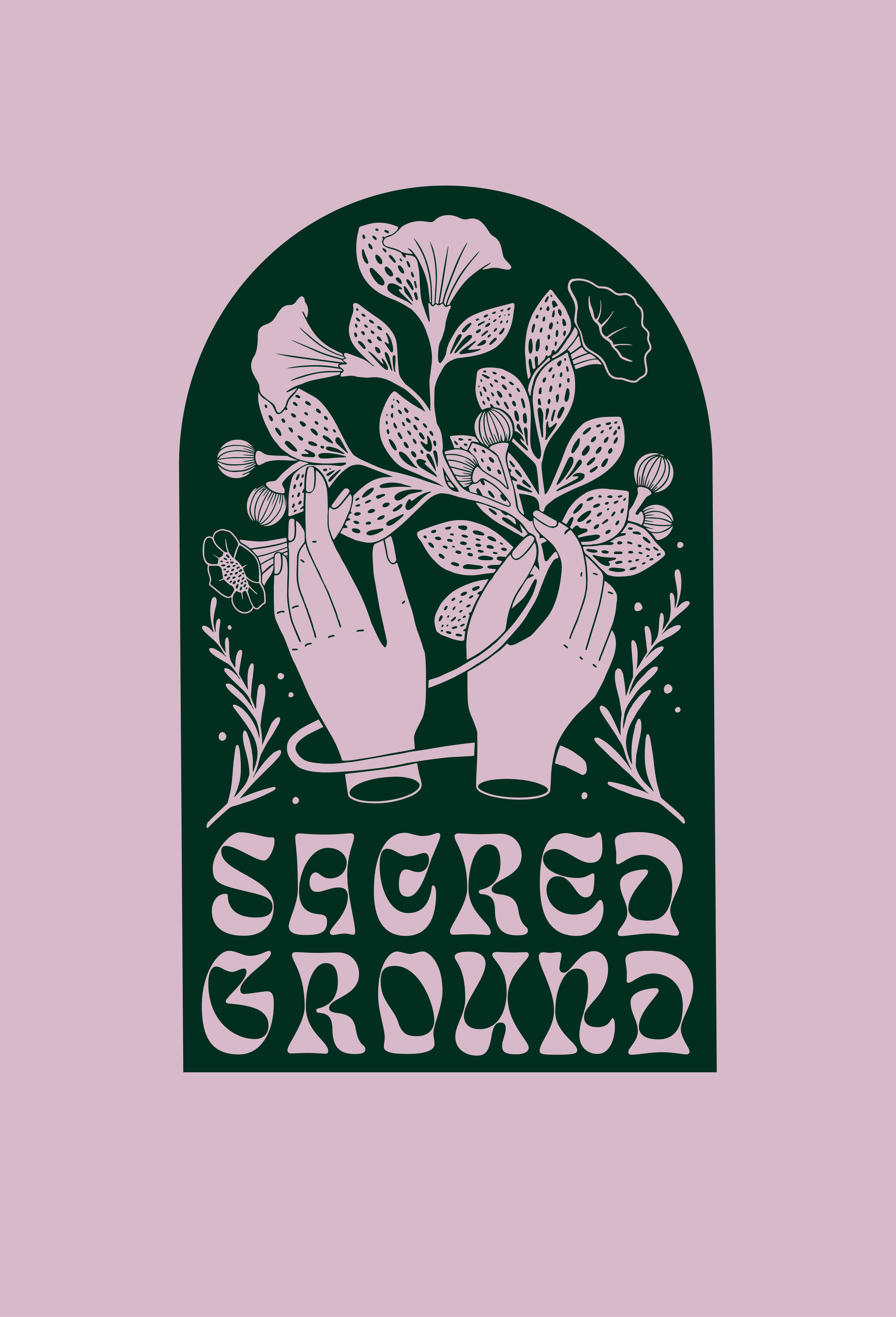
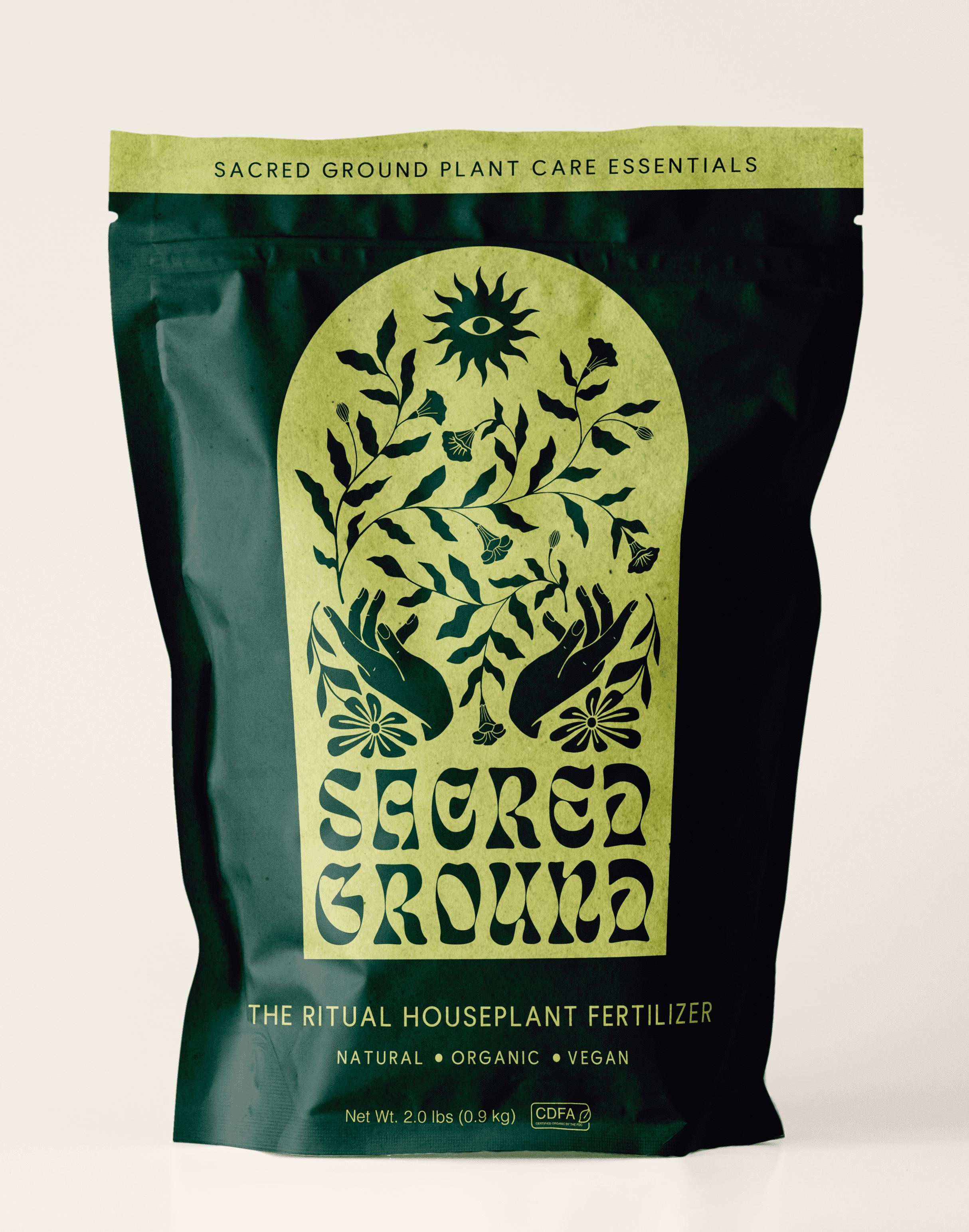
The detailed illustrations on Sacred Ground's packaging are each hand-drawn. Recurring motifs within these designs play on traditional mystical symbols such as the Eye of Ra while the arched
frames are reminiscent of religious architecture. These elements serve to reinforce the brand's philosophy that plants can have a powerful impact on us physically, mentally, and spiritually.
INSPIRATION
During this project I challenged myself to create a sincere and deeply-rooted identity for something slightly less palatable, to do it in a way that is bold and unconventional, and to break some of my most precious design rules. After reading about Craig Dubitsky's extraordinary success taking toothpaste from a commodity to a beloved brand with Hello Products, I was inspired to elevate a product consumers barely want to buy. I settled
on fertilizer both because of its obvious unpleasantness, and because it is environmentally damaging, bulky, and exists in a space with nearly zero product differentiation.
The final result is just the right mix of rebellious and traditional for a youthful and purpose-driven fertilizer brand and I'm confident that it would stand out in the gardening aisle.
