Ventra Transit
Services
Product Design
UX Design
User Research
Date
August 2020
Scroll

RESEARCH
Before beginning ideation, I analyzed the scope of current fare collection systems, determined the needs of users and their motivations for utilizing CPT and the Ventra app, and identified their pain points.
AUDIENCE
Based on preliminary research on Chicago transit ridership, I identified my main audience as a diverse collection of both regular and temporary commuters.
- Suburban Commuters — Regular users who primarily ride the Metra train, these users choose public transportation out of convenience and likely use it only to travel to and from work
- Chicago Natives — Regular users who live downtown, these users are more likely to use the CTA and Pace buses for all their transportation needs
- Tourists and Occasional Riders — These users are visiting Chicago for a brief time or only use public transportation on occassion, they primarily rely on the 'L' train
MOTIVATIONS
I also synthesized users primary motivations for adopting the mobile app using the UX interviews conducted prior to its intial release and found the most common to be: reducing time spent in the station, the convenience of having your
“pass” on you all the time (feature not yet incorporated), the ease of having route/time/transit info in one place, and automatic card reloading and low balance notifications.
PAIN POINTS
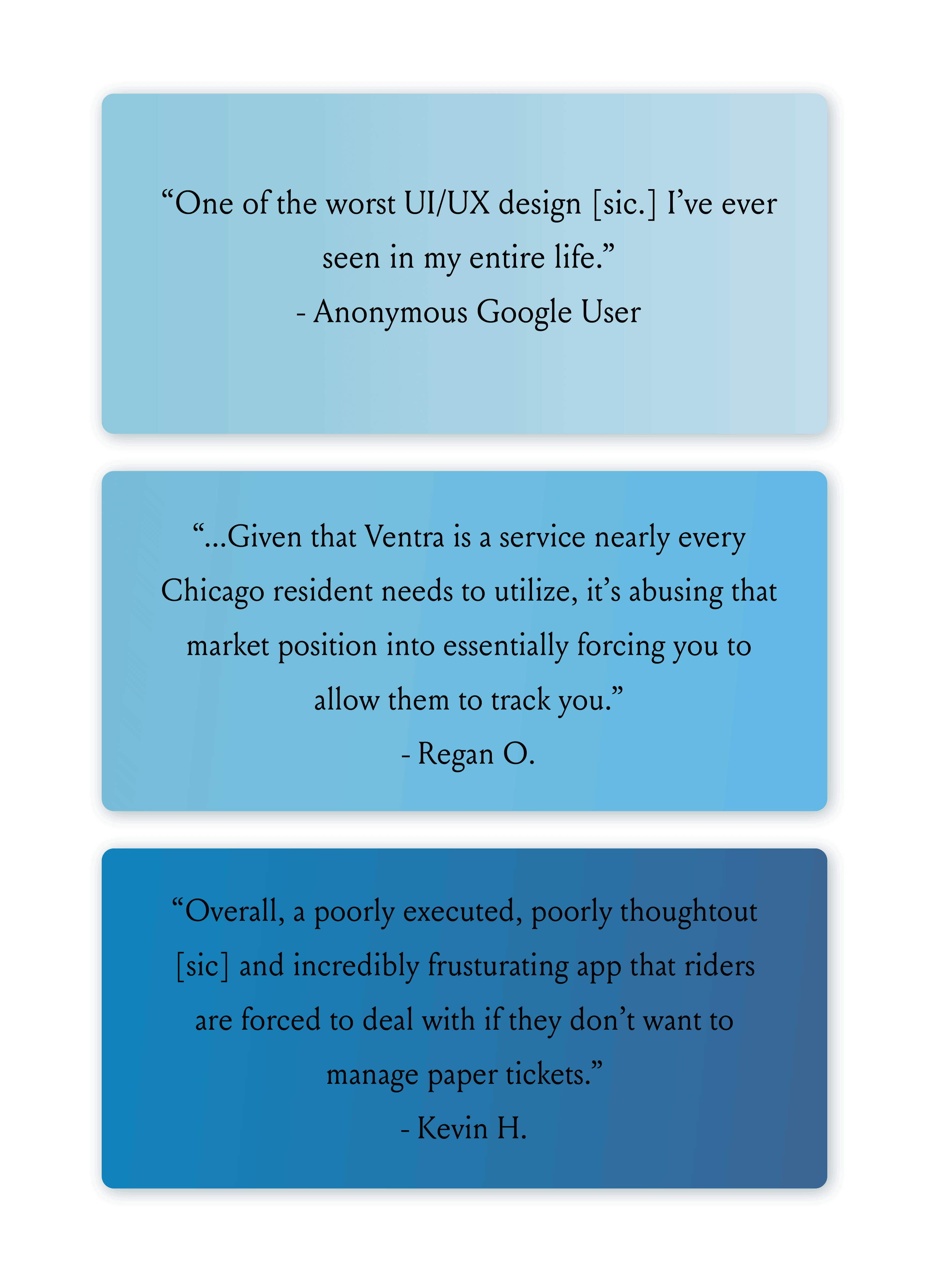
I coded hundreds of reviews for the Ventra app from the Google Play App Store for common issues including miscellaneous bugs, issues logging in, trouble accessing cards between devices, inaccurate transit info, privacy violations, and overcharging for rides.
I also interviewed a small group of of riders at my local transit stop (which includes an 'L', Metra, and CTA/Pace bus stop) to capture additional user perspectives. Most shared the same complaints as online reviewers and were interested in expanding Ventra's features.

IDEATION
First, I used my research to establish three distinct personas which capture the breadth of potential Ventra mobile app users, not only demographically but in purpose, needs, and pain-points.
PERSONAS
- Stan Lewinsky - is a wealthy middle-aged suburban businessman who voluntarily rides the Metra to work
- Monica Ogilvy - is a young Chicago native and nurse on the South Side who regularly uses CTA and Pace buses
- Lucas and Marcia Oliveira - are visiting Chicago for two weeks with their young children; they use the 'L' and CTA buses to visit tourist destinations.
Based on these personas and the user motivations from my research, I created informal user flows for each task one might wish to complete with the app. I used these user flows to determine the information architecture of the app.
PROOF OF CONCEPT & USABILITY TESTING
Over several weeks, I worked with this information architecture and my user pain points to produce low-fidelty wireframes for some of the most important app screens and linked them into a very basic interactive prototype. I conducted informal usability testing by asking individual Chicago Transit riders to complete some of the aforementioned tasks such as creating a Ventra account, checking transit times on a regular route, and adding
transit value to an existing Ventra card and recording the time they took to complete the task as well as the number of incorrect clicks they made. Additionally, I asked users which additional features, if any, made their transportation experience more convenient or more confusing. I designed and updated my prototype interatively based on this testing, making several changes to the interface and features.
IMPLEMENTATION
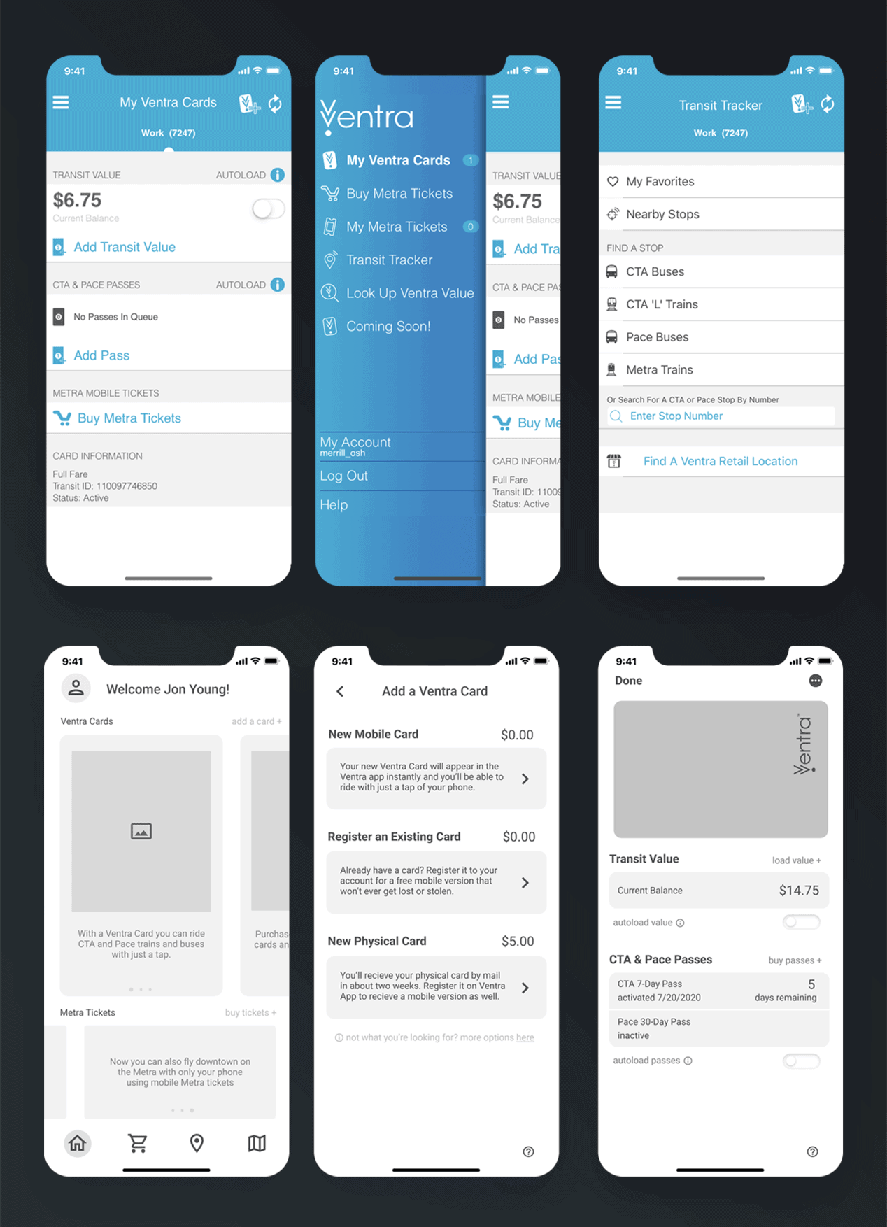
Once I was confident in the functionality of my design, I created an incomplete high-fidelity prototype incorporating both modernized visual design ideas and the current Ventra branding. The responses I observed during usability testing prompted me to prioritize accessibility over minimalist design by adding labels to all icons and maximizing color contrast within the interface.
MAJOR CHANGES
- Transit Store - an entirely new feature that allows users to purchase tickets/passes/transit value in one convenient location
- Transit Search - a simplfied transit tracker that encourages users to search for stops and add frequent routes to favorites
- Dispute Charges - a simple addition to account history that allows users to dispute charges made to their Ventra card through the app, avoiding long customer service wait times
- Journey planner - a new service that enables users to plan a trip to/from a destination on public transit, purchase any necessary passes/tickets for the trip, and add it to their calendar in advance
- Privacy protection - all users can now choose to accept or decline location services, declining only alters access to features which require location tracking
IMPACT
I hope this project can inspire future updates to the Ventra mobile app and push the city of Chicago and the CTA to demand better performance from their mobile payment system on behalf of the city's transit riders.
In October 2020, about two months after I completed this
project, the CTA released an updated version of the app including several of my suggested features such as Metra tickets available from the home screen, ability to plan trips in advance, and a simplified UI for the transit tracker. You can check out the improved app here.